
Tomco Retail Construction
I had the opportunity to work with TOMCO Retail Construction, a certified woman-owned, national general contractor that’s redefining retail construction through client-focused solutions and fair, fiscally sound practices. Founded in 2015, TOMCO is known for its strong partnerships, innovative approach, and dedication to delivering exceptional results in every project.
Service
Identity & Branding, Print
Client
Tomco
Year
2018-Present
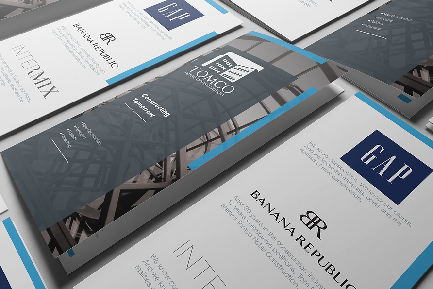
When TOMCO Retail Construction launched in 2018, they tasked me with building their brand identity from the ground up. I was thrilled to work with a national client, especially one looking for a professional style that would align with the major retailers they serve. To meet this goal, I developed a neutral color palette and classic typography, reflecting the corporate atmosphere they wanted to convey.


The Logo
Because the main focus of TOMCO is commercial construction, I wanted to incorporate a commercial building in the logo while maintaining the corporate aesthetic they desired. Drawing on color theory, I used shades of blue to convey trust and reliability, and paired them with gray to reinforce a professional, no-nonsense tone—making it clear they specialize in commercial rather than residential projects.


